Our December printing customer of the month is Someone Creative, a customer since 2014!
Read More >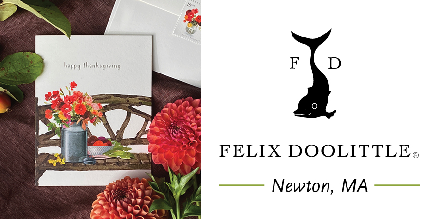
Our November printing customer of the month, we are proud to say, is Felix Doolittle!
In early 2013 this extraordinary stationery company was in search of a printer they could partner with. I am happy to say that their search led them to TPI Solutions Ink, a neighbor and specialist in high-quality, short run, digital printing, just a mere two miles away from their studio in Newton.
Our TPI Solutions Ink philosophy, is to develop long-term, trusting relationships with our clientele while offering fair prices and high-quality printed products. Our relationship with Felix Doolittle, the company, and Loren Sklar and Felix Fu, the owners, embodies this philosophy. We consider Felix and Loren friends as well as partners in this crazy little world of paper goods and print.
When we began working together ten years ago, Felix Doolittle was just getting back into selling their beautiful stationery wholesale. We worked with them those first few years, printing very small quantities of many different card designs while they built up their wholesale clientele. We came up with a wholesale pricing plan that worked for both of our companies, allowing small reorders until FD was able to determine the demand for different card designs. We are always open to working with other small businesses to come up with sensible print solutions and pricing models, that will help them meet their needs and enable them to grow.
Today we print over 500 different greeting card designs for Felix Doolittle, all on Mohawk Superfine Eggshell Cover on our HP Indigo 7900 Digital Press. In addition, some of the other products we print are their bookmark sets with matching die cut sleeves, belly bands and labels for their packaging, pin and sticker backing cards, their annual calendar and more! It's always exciting to see what Felix and Loren will create next. Be sure to visit their online store and grab one of their 2024 desk calendars before they are gone!
Read More >