This was originally posted on April 12, 2012.
Because TPI Solutions Ink is located in Waltham, MA providing print services and solutions to the greater Boston area and beyond, we could not miss this opportunity to write about graphic design and The Boston Marathon over the years. Enjoy!
The 116th Boston Marathon will take place this Monday, April 16th. To celebrate, we're taking a look back at the graphic design and advertising in print that has been used to market the event. Below are various groups of posters and advertisements from years past.
Past Posters
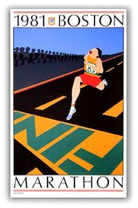
1981 Poster
1997 Poster
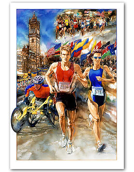
2003 Poster
This first set of printed posters above demonstrates a classic illustrated style. The use of many different colors and strong perpective make for interesting compositions. These designs have a nostalgic feel that represent the history of the Boston Marathon.
Recent Posters
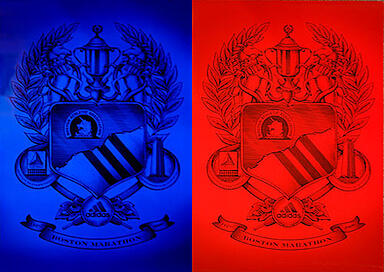
2008 Posters
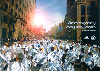
2009 Poster
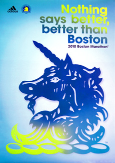
2010 Poster
The second set of posters above are from more recent years. The bold colors, graphics and clear typography give the designs a very modern feel. These designs are much more streamlined than those from past years, and represent the simple and effective style used in a lot of advertising today.
Adidas Campaign
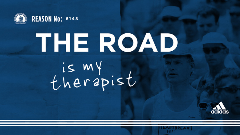
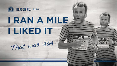
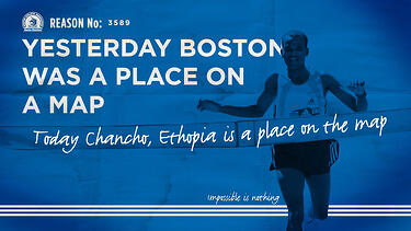
Adidas has been the offical footwear sponsor of the Boston Marathon for years. This campaign demonstrated what running meant to different individuals involved in the marathon. The simple color scheme paired with bold type and photographs sends a strong message and makes for a very successful series.
New Balance Campaign
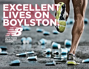
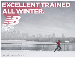

Last year New Balance created a campaign intended to take advantage of marathon time, without ever actually mentioning the word marathon. Instead, they used strong photography and suggestive phrases to get their point across. These advertisments promote the New Balance brand while empowering runners at the same time.
We hope you enjoyed our analysis of graphic design and advertising in the Boston Marathon. What's your favorite Boston Marathon print campaign? Will you be running or cheering someone on this year?

