Like most graphic designers, I'm a huge typography nerd. I love letters in their many forms and have an extremely large library of typefaces at my disposal. In our previous Typography 101 blog, we went into some of the basic terms associated with typography. This blog will tell you all about the different styles that fall under the broad classification of serif type. We've got lots of fun facts to get to, hope your ready to learn!

The first type style we're going to explore is old style. Old style typefaces were originally created from the late 15th century to the early 18th century. Their most common features include low stroke weight contrast, heavy hair lines, and bracketed, angled serifs.
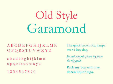
An example of old style type is Garamond. Garamond was created by French punch-cutter Claude Garamond (1480–1561) in the late 15th century. Some unique characteristics in his letters are the small bowl of the a and the small eye of the e. Many of the Garamond typefaces in use today are more closely related to the type designs of Jean Jannon, another French punch-cutter, who issued a specimen of typefaces that had some characteristics similar to Garamond 60 years after his death. Garamond is widely considered to be one of the most legible and readable typefaces ever created.

The style that evolved from old style type was transitional. Transitional typefaces bridge the gap between
Old Style and Modern serifed typefaces in the mid 18th century. Characteristics of these typefaces include a more vertical axis and sharper serifs than had previously been designed.
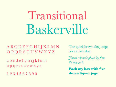
Baskerville was created in 1757 by John Baskerville in Birmingham, England. The typeface was designed along with Baskerville’s work in creating a higher standard for printing. He experimented with both ink and paper making and eventually redesigned the printing press itself to better capture the subtleties of his type. Baskerville showcases crisp edges, high contrast and generous proportions and remains one of the most popular transitional typefaces to this day.

Modern typefaces, also referred to as Neoclassical or Didone, were created in the later part of the 18th century. Characteristics of these typefaces include dramatic stroke contrast, a vertical axis and horizontal stress. In many cases, stroke terminals are ball shapes.
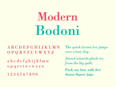
Bodoni was created by Giambattisa Bodoni in 1798. Bodoni’s design was highly influenced by John Baskerville, whose work he followed very closely. Bodoni was hired by Duke Ferdinand of Parma to establish a premiere royalty press for the aristocracy. His attention to detail and work ethic lead him to be regarded as the greatest printer of the time. Bodoni is one of the most reproduced fonts in existence. There are over thirty different modern interpretations of the typeface available.

Slab serif typefaces, also called Egyptian, became popular in the 19th century. They are characterized by very heavy serifs with minimal or no bracketing. The stroke weight of all letters typically has low contrast.
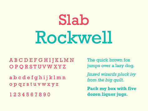
Rockwell was created by Frank Hinman Pierpont in 1933. Its design was heavily influenced by another typeface, Litho Antique, which was released in 1910. Rockwell has been widely used since it’s creation and remains one of the most popular slab serifs among designers. Its distinctive features include a serif at the apex of the uppercase “A,” an “O” that is more of a circle than the usual ellipse shape, and a two story lower case “a,” which is unusual for such a geometrically designed typeface.
We hope you've learned a lot about serif typefaces from reading this post. Stay tuned for our next blog in this series: all about sans serifs.
Want more typography fun? Click the button below and we'll mail you a FREE 2015 typography calendar.

